Livewire Student Ministries is a small middle school and high school ministry located in Paducah, Kentucky. They needed a logo that is modern and edgy but still clean. And since they are a school ministry, the logo must be something that must appeal to teenagers. It should represent an exciting, vibrant and edgy student ministry. The name of the ministry is edgy enough. The logo for the ministry should match this. The challenge here stems from the request of the client to have the logo edgy but clean… Edgy but clean…. Seems like two highly contradicting requirements for me.
I decided to work on a text-based logo, using minimal graphic components. Using a clean font (Futura MD) to work on with 50% kerning, I figured out to play around with the I's of the "LIVEWIRE" text. The distance between the I's is ideal to create a large enough circle to base the additional design. Imagine this circle as a circuit, a "live" wire with 2 surges of electricity flowing around. Imagine these surges to represent the I's, or even the dots of the I's, if you will:
Since the ministry's colors are orange, silver, black and white, the design should accommodate these colors. Now imagine the "live circuit", close the lights, and then you see the surges glowing bright!
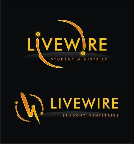
I would love to see this animated. I also made a standalone symbol based on the "live circuit" concept in case they need it. I can't deny the influences of Heroes on this particular design (the circle is similar to the eclipse, and the font used is basically the same), but I guess this can be considered a strength of this logo. It is not a rip off the Heroes design (I refuse to say so), but it somehow "inherits" the coolness factor of the show, thus would be something teenagers would appeal to.


1 comment:
I have read your article, it is very informative and helpful for me.I admire the valuable information you offer in your articles. Thanks for posting it.. Logo design
Post a Comment