Livewire Student Ministries is a small middle school and high school ministry located in Paducah, Kentucky. They needed a logo that is modern and edgy but still clean. And since they are a school ministry, the logo must be something that must appeal to teenagers. It should represent an exciting, vibrant and edgy student ministry. The name of the ministry is edgy enough. The logo for the ministry should match this. The challenge here stems from the request of the client to have the logo edgy but clean… Edgy but clean…. Seems like two highly contradicting requirements for me.
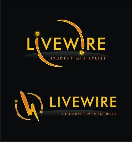
I decided to work on a text-based logo, using minimal graphic components. Using a clean font (Futura MD) to work on with 50% kerning, I figured out to play around with the I's of the "LIVEWIRE" text. The distance between the I's is ideal to create a large enough circle to base the additional design. Imagine this circle as a circuit, a "live" wire with 2 surges of electricity flowing around. Imagine these surges to represent the I's, or even the dots of the I's, if you will:
Since the ministry's colors are orange, silver, black and white, the design should accommodate these colors. Now imagine the "live circuit", close the lights, and then you see the surges glowing bright!
I would love to see this animated. I also made a standalone symbol based on the "live circuit" concept in case they need it. I can't deny the influences of Heroes on this particular design (the circle is similar to the eclipse, and the font used is basically the same), but I guess this can be considered a strength of this logo. It is not a rip off the Heroes design (I refuse to say so), but it somehow "inherits" the coolness factor of the show, thus would be something teenagers would appeal to.
Kinze Manufacturing, Inc., an agricultural company that manufactures row crop planters and grain wagons needed graphical symbols representing 5 Core Values that will be used internally for the company employees and for their external customers and dealers who will see them when they come on-site for tours and training sessions. They wanted the symbols to bring to mind the core value associated with it whenever the employees saw these. Their customers and dealers will better understand the company culture after seeing the symbols. The 5 core values are Integrity, Customer Focus, Excellence, Innovation, and Mutual Respect:
They are defined as follows:
Integrity: "We will conduct ourselves in the highest ethical manner in all relationships. Honesty, commitment, truth, and honor are not just words; they are the governing Christian principles by which we conduct our business."
Customer Focus: "We are customer-driven. There must be a sense of urgency on any matters related to our customers. Service and warranty are ahead of profit. Customers assure our future and drive our growth. We are in business as a result of the trust and loyalty of our customers."
Excellence: "We are committed to excellence. It must permeate our culture and every aspect of our activities. Each of us must make a maximum effort to provide a quality product that responds to and anticipates our customer needs. Our products must meet and exceed competition. Rather than asking "is it good enough", we must ask, "how can we do it better?" The policies and procedures we implement will guide the management of our organization's crucial resources so we can remain profitable. Operational excellence will be achieved by working together as a team and diligently performing tasks in an exceptional manner. The quality of everything we do reflects on us and is essential for maintaining long-term relationships with our customers, suppliers and employees."
Innovation: "Innovation is critical to our success. Our workplace must be an environment where creativity and new ideas, consistent with our company direction, have the ability to reach their full potential. We welcome new challenges as opportunities for growth and must be able to quickly react to our customer needs."
Mutual Respect: "Mutual respect is the ability to listen and learn from everyone. We care about the professional and personal well being of each member of Kinze Manufacturing, Inc. People are our greatest asset and we will strive to exhibit care, concern and interest in those with whom we work and with whom we do business. Our work environment respects individual talents and provides opportunities for training, leadership development, professional growth and financial reward. A secure, highly motivated, and well-trained workforce will thrive and enjoy the challenges of meeting our customer needs."
I designed the logos to have a central agricultural theme, using elements relevant to the nature of their farming business. I developed 2 concepts for this project, one using greater detail with all the symbols arranged in a ring style. The other used simpler brush strokes and arranged in a cartouche style. The symbols for both are very similar. For integrity, I chose the symbol of a single tree. For customer focus, that of a seedling – the customers after all are the foundation of the company, and I drew hands tending to its growth. Excellence was represented through the traditional 1st place medal. Innovation is represented by their product – the tractor and in the other version, the tractor wheel. Mutual respect is shown through hands in agreement:
Ring Kinze:
Cartouche Kinze:
The client eventually bought the rights for "Ring Kinze", but personally I liked "Cartouche Kinze" better. But of course, the client knows best. Which would you choose?
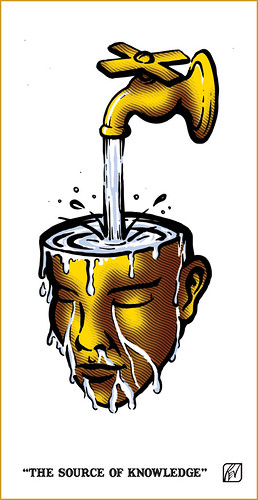
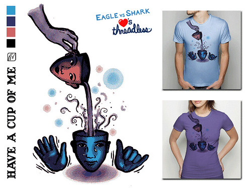
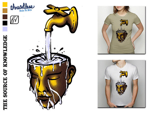
Once in a while, I create t-shirt designs, and rather than have them saved in my hard disk, I prepare them as entries for Threadless' Competitions. As I mentioned in an earlier blog, all the designs in Threadless are created by the members themselves, go through a process of voting by the community. Once chosen to be printed, the designer wins $2,000 of prizes (cash and gifts). There are numerous Filipino designers there and some already had their designs printed and sold. I aspire to be one of them.
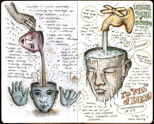
During the latter parts of summer vacation, I managed to finish two t-shirt designs based on sketches I made in my notebook:
Here are the finished digitized versions:
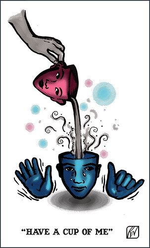
I already submitted them at Threadless, and now, they're already up for voting:
I know my design is a little surreal and "weird" for the general public's taste. Not everyone would want to wear dismembered heads and hands on their shirts. It seems most designs at Threadless that get printed are the cheesy and cutesy designs catering more to their predominantly American teen population. But you'll never know. Help my designs get a good score by clicking on the images above or the links below and by voting only 5$... and if you have extra time, leave nice comments! Time's running up for voting…
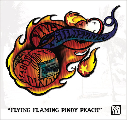
"Hey Rev! Any chance you can design a cool, standout race outfit for Glen and myself when we walk/run/crawl the Peachtree Road Race on July 4?" Apparently, I didn't realize that posting pictures of your tee designs and Body Combat event costumes will almost surely invite requests such as this. Friends of Tessa know that they will be participating in the Peachtree 2007 Road Race this coming July. Of course, I'm not the type who will decline to such requests. My only limitation would be time, and being involved in a lot of busy-ness… it's one I always wish I have lots of (I even wish I don't have the need for sleep… Imagine what you can do with 6-8 hours!).
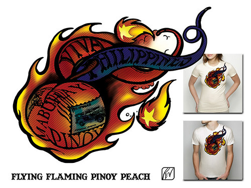
Tessa wanted the design to revolve around 30 (she'll be turning 30 soon…), Manila/Filipiniana, 4th of July, Atlanta, Pinoy/Pinay Peach (state fruit of Georgia) etc. This is so interesting and thought-provoking that my mind was already running with ideas as I was reading her message. I remember replying with this "I'm thinking of a shirt design, featuring a realistic Filipinized "peach" (I've been looking at previous winning shirt designs sa race niyo), so if both you and Glen are wearing it, the two of you will be wearing peaches on your shirts... looking good enough to eat. When I mean Filipinized, parang may tatak Pinoy (flag colors, sun and stars) on the peach itself. It will be photo-manipulated work. But it's still an idea... We might go for a more graphic iconic look." It's important for me to write it down, the idea at least. Soon, I found time of actually realizing the idea into a sketch in my notebook: Flying Flaming Pinoy Peach!
Got feedback from her and I found this one quite amusing: "Can you separate the star ball at the bottom left from the big ball of peach/fire? Or is it supposed to be there talaga? It kinda looks like a big nipple when attached to the big ball, hehehe :)" Yeah, it does look like a nipple, haha. A month later, I found time to digitize the sketch, adding in photo-manipulated elements of stamps and digital painting with etching effects. I was going for a striking design, like when you see it, you'll say "peach flambé!" while still emoting Filipino pride.
And the design, as I intended it to look on the shirts:
And Tessa as the model for the shirt:
Too bad, I won't have time to actually supervise the printing myself, since I'll be very busy. This will look best printed through digital silkscreen process with embossed rubberized inks for the black outlines. (Especially if it will be mass produced, 'di ba Tessa?) For the meantime, I asked Tessa to have it printed on their shirts through transfer process in time for their race.
Good luck to Tessa and Glen, the Flying Flaming Pinoy Peaches!
Being busy with serious stuff, I don't have time to even bother hearing or reading news. So, it will come as a surprise that being a graphic art creator and appreciator, I wouldn't know about the unveiling of the official London 2012 Olympics logo. It seems the logo has created such an uproar in the UK, I had to hear about the news from my friends there.
London was awarded as the official site of the 2012 Olympics, and the original candidate logo shows a flowing ribbon in the Olympic colors representing the legacy of the River Thames to the city, giving life to it:
It's a wonderful design and the concept of using the ribbon as a design element is simply fantastic. Recently, the Olympic organizing committee chaired by Sebastion Coe unveiled the new London 2012 emblem claiming it to be the "the vision at the very heart of our brand" The emblem, as the organizers say aims to be "dynamic, modern and flexible reflecting a brand savvy world… a reminder of our promise to use the Olympic spirit to inspire everyone and reach out to young people around the world."
It is indeed a massive leap of change in design from the original concept. The emblem comes in 4 vibrant colors and for the first time, the Paralympic Games (shown lower right) will share the same shape as that of the Olympic Games.
Sadly, the rest of the world does not share in this vision, calling it various derogatory names and invoking images that I won't dare mention here. There is even an ongoing petition to have the logo removed and replaced. What do you think?
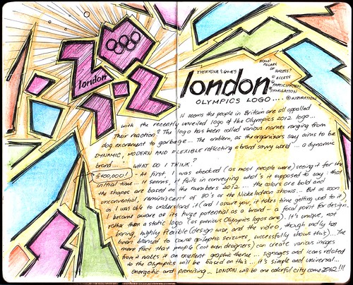
At initial glance, I was shocked (as the rest of the world was). I had a hard time trying to understand the logo, and it seems that whatever it was trying to represent, it failed to do so. It was indeed eye-catching and bold, but puzzling as to what it tries to convey (I realized only later after reading a brief about its design that the shapes are based on the numbers 2012). The colors are bold and unconventional, reminiscent of the punk 80's or Nickelodeon shorts. It looked like a mess having those cryptic jagged shapes in those flashy colors.
But as soon as I was able to understand the design (and I tell you, it took some time!), reflecting on what the designers at Wolff Olins (who also designed the Athens 2004 Olympics emblem) could have been thinking when they came up with this design, it becomes a realization that the logo possesses huge potential as a brand (take note, there's a huge difference between a brand and a logo… a logo is simply a graphic representation while a brand represents the "moving idea", and the logo is just a part of it). As a brand, it can be a focal point for the visual design of the whole Olympics Games, rather than being just a static logo. It is unique, not boring (definitely!) and highly flexible (design-wise, and the video, though being accused of causing epileptic fits, was able to successfully show how dynamic the emblem could be). The mere fact that ordinary people can conjure up various images, (ranging from the imaginative to humorous and even obscene!) proves it can be a dynamic graphical theme. It's simple (yet dynamic) and universal, energetic and promising. Olympic signages and icons will be based on these shapes or colors. London will be one colorful city come 2012. But all this will depend on how the logo will be executed… and unfortunately, it may not live up until 2012 to see it come to life due to the overwhelming public loathing.
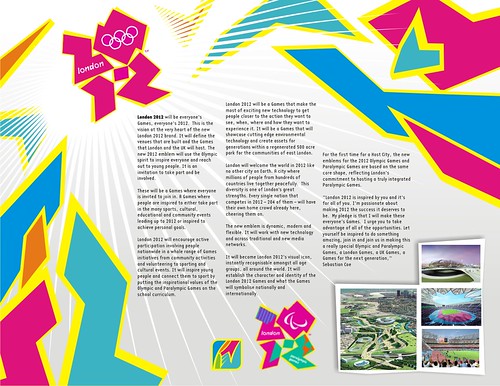
I must admit that it is not a pretty logo in the "classic" sense. But all I'm saying is that the London 2012 Olympic logo COULD work… and to test if it could indeed look creative and appealing, I quickly made a concept poster featuring the logo using the description brief from the official site and images of what the Olympic venues would look like.
Hmmm… I think it could work. Note how I "londonolympicized" my own logo into the poster.
Here's the journal entry capturing my initial thoughts and drawings on the London 2012 Olympics emblem.
I wasn't able to really relish the latter months of summer vacation as I was deeply involved in setting-up the Community-Based Rehabilitation (CBR) Program in San Mateo, Rizal. After a year of scheduled meetings with the key stakeholders in the municipality, implementation of research and extension teaching services (embedded within the curriculum of OPST 131: Introduction to Community Health), the time is finally getting ripe to start anew. Of course, there are many obstacles yet to conquer, one of which is the result of the recent elections where the mayor I was planning with did not win. It has to be ensured that what was set be properly endorsed to the incoming municipal administration, otherwise plans will be set back. The CBR Program in Montalban is assured of its place and support by their municipal government, but consultancy programs must be properly set to ensure a smooth exit.
The CBR Volunteer Workers Basic Training Program was successfully implemented at the Nuestra Señora de Aranzazu Parochial School from May 28 to June 1, 2007, attended by participants from both San Mateo and Montalban. Unlike previous runs of the Training Program which usually lasts a month, this only ran for a week, focusing primarily on the attitude and basic CBR knowledge of the CBR Volunteer Worker. The original training program included more technical topics ranging from basic anatomy, neuroanatomy and human development to PT, OT and SP assessment and treatment. This focused on the CBR program, the roles of the CBR Volunteer Worker (focusing more on the transdisciplinary approach) and it being a vocation. The training program turned out to be a seminar and retreat rolled into one, focusing on empowering the participants and forging their commitment and willingness to serve persons with disabilities (PWD's) within their community. With this as focus of the seminar, the participants will be ready to take in the more difficult technical aspects of the training (which will be provided year-round by the incoming interns and clinical supervisors as part of the CBR training program). We realized that it is better to create empowered willing volunteers than half-hearted trained intelligent workers. An empowered willing volunteer is more than ready to learn (in fact, seeks to learn!), and is much easier to teach than a worker with vested interests. It is sad to note that the "volunteer" ceases to exist once his/her services are equated with monetary compensation. Most of the problems related to the CBR Workers in Montalban (note, the word "volunteer" was dropped mysteriously) I suspect started when they were given monetary allowance by the municipal government as appreciation of their services. In time, and I guess it is sadly inevitable, they unconsciously equated it with "salary"… payment for their services. It was the design of the training program to instill a true sense of volunteerism – a vocation, essentially… among the new CBR Volunteer Workers.
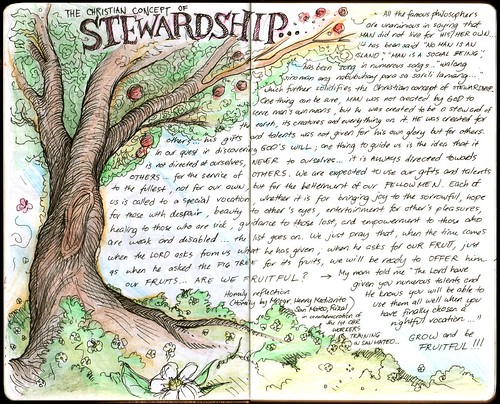
The training program culminated in a mass celebrated by Monsignor Mediarito, the parish priest of Nuestra Señora de Aranzazu shrine, who fully supports the program and recognizes it as a ministry activity of its parish. Providently, the gospel on that Friday Mass features the barren fig tree curse by Jesus. Monsignor Mediarito provided a very relevant homily which inspired not only the graduate participants but also the rest of the church attendants. Here are the thoughts on the gospel, heavily inspired by the homily:
All the famous philosophers are unanimous in saying that MAN does not live for his own alone. It has been often said "No man is an island…", "Man is a social being"… has been sung in numerous songs… "Walang sinuman ang nabubuhay para sa sarili lamang…" which further solidifies the Christian concept of STEWARDSHIP. One thing can be sure, MAN was not created by GOD to serve man's own means, but he was created to be a STEWARD of the earth, its creatures and everything on it. He was created for others… his gifts and talent was not given for his own glory but for other. In our quest in discovering God's will, one thing surely to guide us is the knowledge that this will is not directed towards ourselves… NEVER to ourselves… it is ALWAYS directed towards OTHERS… for the service of others. We are expected to use our gifts and talents to the fullest, not for our own, but for the betterment of our fellowmen. Each of us, is called to a special vocation… whether it is for bringing joy to the sorrowful, hope to those down with despair, healing to the sick, guidance to those who are lost, and empowerment to those who are weak and disabled… the list goes on. We just pray that when the time comes when the Lord asks from us what He has given and how we have used it; when He asks for our FRUIT, just as when He asked the fig tree… that we will be ready to offer him our fruits.
Being a CBR Volunteer Worker is a vocation to serve. It is directed towards empowering those whom we call persons with disabilities (PWD's). And knowledge alone is not sufficient to help them, but primarily a desire… a genuine to help others. As rehabilitation professionals, we are expected to have a genuine desire to help others, more than a need to fill our pockets. It is amazing to note that 2 of my closest friends who are CBR Workers (Mommy Es and Tatay Ben) have passed away speaking their final words to me, "Sir Rev, kung bigyan lang ako ng pagkakataon na mabuhay pa, gugustuhin ko pa maging CBR Worker…" Amazing. Inspiring. It makes me reflect, that amidst our quest to enrich our knowledge and skills with cutting-edge advancements in our fields, whether we are also seeking to strengthen our resolve… the spirit that drives us to serve other people.
The above is my journal entry featuring my noted thoughts on stewardship. Pictures from the CBR Volunteer Workers Basic Training program can be seen at my Flickr account.